
How Accurate Are Our Predictions?
By Javier Prieto
When investigating a grant, Open Philanthropy staff often make probabilistic predictions about grant-related outcomes they care about, e.g. “I’m 70% confident the grantee will achieve milestone #1 within 1 year.” This allows us to learn from the success and failure of our past predictions and get better over time at predicting what will happen if we make one grant vs. another, pursue one strategy vs. another, etc. We hope that this practice will help us make better decisions and thereby enable us to help others as much as possible with our limited time and funding.[1]Here is a fuller list of reasons we make explicit quantified forecasts and later check them for accuracy, as described in an internal document by Luke Muehlhauser:
There is some evidence that making and checking quantified forecasts can help you improve the accuracy of your predictions over time, … Continue reading
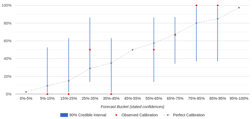
Thanks to the work of many people, we now have some data on our forecasting accuracy as an organization. In this blog post, I will: Grant investigators at Open Philanthropy recommend grants via an internal write-up. This write-up typically includes the case for the grant, reservations and uncertainties about it, and logistical details, among other things. One of the (optional) sections in that write-up is reserved for making predictions. The prompt looks like this (we’ve included sample answers): Do you have any new predictions you’re willing to make for this grant? […] A quick tip is to scan your write-up for expectations or worries you could make predictions about. […] After a grant recommendation is submitted and approved, the predictions in that table are logged into our Salesforce database for future scoring (as true or false). If the grant is renewed, scoring typically happens during the renewal investigation phase, since that’s when the grant investigator will be collecting information about how the original grant went. If the grant is not renewed, grant investigators are asked to score their predictions after they come due.[2]In some rare cases, it’s possible for the people managing the database to score predictions using information available to them. However, predictions tend to be very in-the-weeds, so scoring them typically requires input from the grant investigators who made them. Scores are then logged into our database, and that information is used to produce calibration dashboards for individual grant investigators and teams of investigators working in the same focus area. A user’s calibration dashboard (in Salesforce) looks like this: The calibration curve tells the user where they are well-calibrated vs. overconfident vs. underconfident. If a forecaster is well-calibrated for a given forecast “bucket” (e.g. forecasts they made with 65%-75% confidence), then the percent of forecasts that resolved as “true” should match that bucket’s confidence level (e.g. they should have come true 65%-75% of the time). On the chart, their observed calibration (the red dot) should be close to perfect calibration (the gray dot) for that bucket.[3]The horizontal coordinate of the gray dots is calculated by averaging the confidence of all the predictions in each bin. Note that this is in general different from the midpoint of the bin; for example, if there are only two predictions in the 45%-55% bin and they have 46% and 48% confidence, … Continue reading If it’s not, then the forecaster may be overconfident or underconfident for that bucket — for example, if things they predict with 65%-75% confidence happen only 40% of the time (overconfidence). (A bucket can also be empty if the user hasn’t made any forecasts within that confidence range.) Each bucket also shows a 90% credible interval (the blue line) that indicates how strong the evidence is that the forecaster’s calibration in that bucket matches their observed calibration, based on how many predictions they’ve made in that bucket. As a rule of thumb, if the credible interval overlaps with the line of perfect calibration, that means there’s no strong evidence that they are miscalibrated in that bucket. As a user makes more predictions, the blue lines shrink, giving that user a clearer picture of their calibration. In the future, we hope to add more features to these dashboards, such as more powerful filters and additional metrics of accuracy (e.g. Brier scores). As of March 16, 2022, we’ve made 2850 predictions. Of the 1345 that are ready to be scored, we’ve thus far assessed 743 of them as true or false. (Many “overdue” predictions will be scored when the relevant grant comes up for renewal.) Further details are in a footnote.[4]Our stats as of 2022-03-16 are as follows (italics means the percentage is taken over scored predictions, not total):
Status
Number
%
Scored
True
382
45%
False
361
42%
Not Assessed
115
13%
Total Scored
858
30%
Not scored
Not Yet Due
1,448
51%
Overdue
487
17%
Missing End … Continue reading
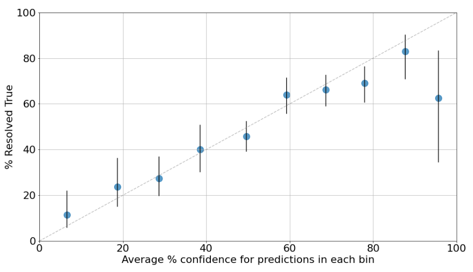
What kinds of predictions do we make? Here are some examples: Some focus areas[5]We’re leaving out focus areas with less than $10M moved in the subsequent analyses. The excluded focus areas are South Asian Air Quality, History of Philanthropy, and Global Health and Wellbeing. are responsible for most predictions, but this is mainly driven by the number of grant write-ups produced for each focus area. The number of predictions per grant write-up ranges from 3 to 8 and is similar across focus areas. Larger grants tend to have more predictions attached to them. We averaged about 1 prediction per $1 million moved, with significant differences across grants and focus areas. Good predictors should be calibrated. If a predictor is well-calibrated, that means that things they expect to happen with 20% confidence do in fact happen roughly 20% of the time, things they expect with 80% confidence happen roughly 80% of the time, and so on.[6]This sentence and some other explanatory language in this report are borrowed from an internal guide about forecasting written by Luke Muehlhauser. Our organization-wide calibration curve looks like this: To produce this plot, prediction confidences were binned in 10% increments. For example, the leftmost dot summarizes all predictions made with 0%-10% confidence. It appears at the 6% confidence mark because that’s the average confidence of predictions in the 0%-10% range, and it shows that 12% of those predictions came true. The dashed gray line represents perfect calibration. The vertical black lines are 90% credible intervals around the point estimates for each bin. If the bar is wider, that generally means we’re less sure about our calibration for that confidence range because we have fewer data points in that confidence range.[7]These intervals assume a uniform prior over (0, 1). This means that, for a bin with T true predictions and F false predictions, the intervals are calculated using a Beta(T+1, F+1) distribution. All the bins have at least 40 resolved predictions except the last one, which only has 8 – hence the wider interval. A table with the number of true / false predictions in each bin can be found in a footnote.[8]Detailed calibration data for each bin are provided below. Note that intervals are open to the left and closed to the right; a 30% prediction would be included in the 20-30 bin, but a 20% prediction would be included in the 10-20 bin.
Confidence … Continue reading The plot shows that Open Philanthropy is reasonably well-calibrated as a whole, except for predictions we made with 90%+ confidence (those events only happened slightly more than half the time) and possibly also in the 70%-80% range (those events happened slightly less than 70% of the time). In light of this, the “typical” Open Phil predictor should be less bold and push predictions that feel “almost certain” towards a lower number.[9]However, given that there is high variance in calibration across predictors, this may not be the best idea in all cases. For personal advice, predictors may wish to refer to their own calibration curve, or their team’s curve. On top of being well calibrated, good predictors should give high probability to events that end up happening and low probability to events that don’t. This isn’t captured by calibration. For example, imagine a simplified world in which individual stocks go up and down in price but the overall value of the stock market stays the same, and there aren’t any trading fees. In this world, one way to be well-calibrated is to make predictions about whether randomly chosen stocks will go up or down over the next month, and for each prediction just say “I’m 50% confident it’ll go up.” Since a randomly chosen stock will indeed go up over the next month about 50% of the time (and down the other 50% of the time), you’ll achieve perfect calibration! This good calibration will spare you from the pain of losing money, but it won’t help you make any money either. However, you will make lots of money if you can predict with 60% (calibrated) confidence which stocks will go up vs. down, and you’ll make even more money if you can predict with 80% calibrated confidence which stocks will go up vs. down. If you could do that, then your stock predictions would be not just well-calibrated but also have good “resolution.” A metric that captures both aspects of what makes a good predictor is the Brier score (also explained in a footnote[10]For binary events, the Brier score can be defined as
\( BS\,=\,\frac{1}{n} \sum_{i=1}^n (P_i\,-\,Y_i)^2 \)
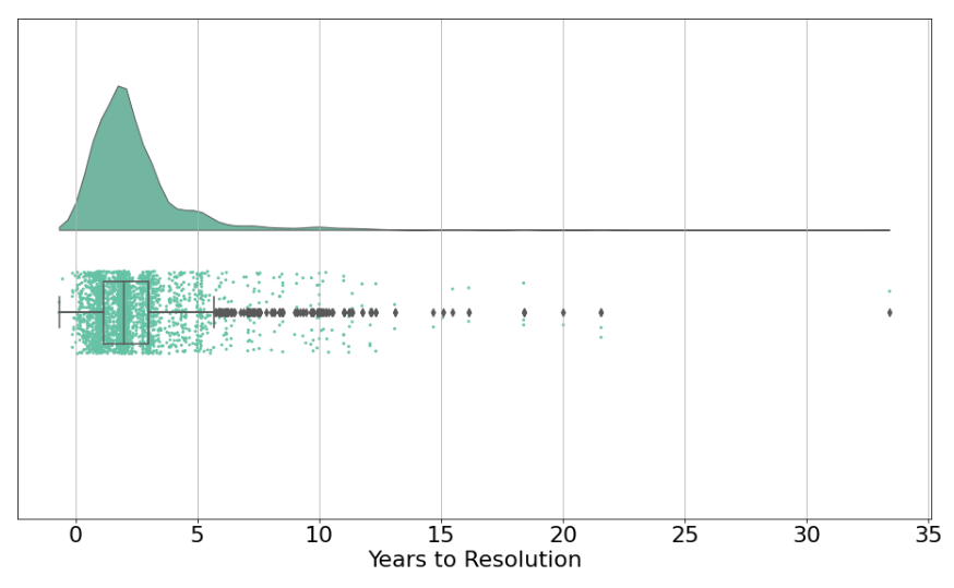
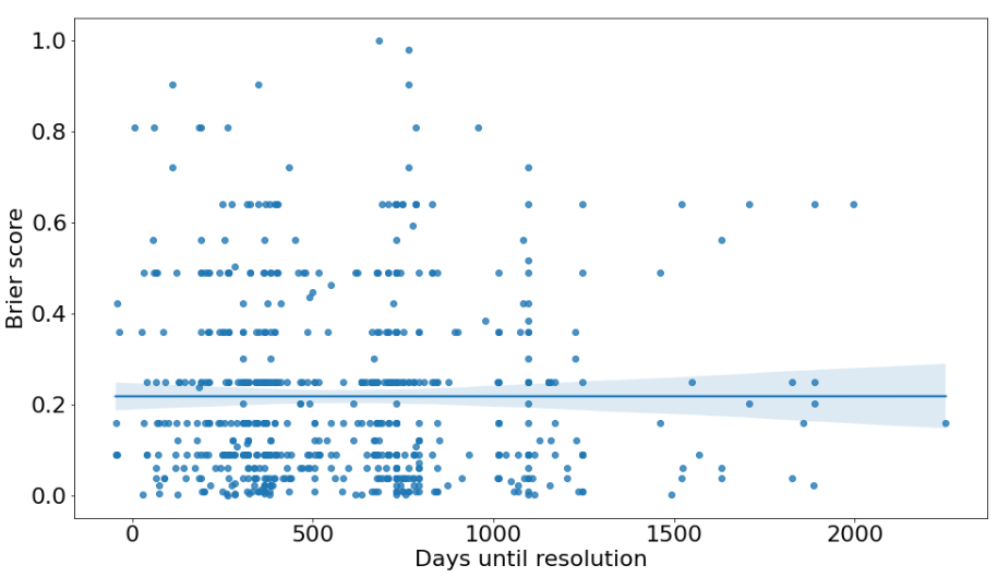
Where \( i = 1,…,N \) ranges over events, \( p_i \) is the forecasted probability that the i-th event resolves True, and \( Y_i \) is the actual outcome of the i-th event (1 if True, 0 … Continue reading). The most illustrative examples are: The mean Brier score across all our predictions is 0.217, and the median is 0.160. (Remember, lower is better.) 75% of focus area Brier scores are under 0.25 (i.e. they’re better than chance).[11]A score of 0.25 is a reasonable baseline in our case because the base rate for past predictions happens to be very close to 50%. This means that predictors in the future could state 50% confidence on all predictions and, assuming the base rate stays the same (i.e. the population of questions that … Continue reading This rather modest[12]For comparison, first-year participants in the Good Judgment Project (GJP) that were not given any training got a score of 0.21 (appears as 0.42 in table 4 here; Tetlock et al. scale their Brier score such that, for binary questions, we’d need to multiply our scores by 2 to get numbers with … Continue reading Brier score together with overall good calibration implies our forecasts have low resolution.[13]For a base rate of 50%, resolution ranges from 0 (worst) to 0.25 (best). OP’s resolution is 0.037. Luke’s intuition on why there’s a significant difference in performance between these two dimensions of accuracy is that good calibration can probably be achieved through sheer reflection and training, just by being aware of the limits of one’s own knowledge, whereas resolution requires gathering and evaluating information about the topic at hand and carefully using it to produce a quantified forecast, something our grant investigators aren’t typically doing in much detail (most of our forecasts are produced in seconds or minutes). If this explanation is right, getting better Brier scores would require spending significantly more time on each forecast. We’re uncertain whether this would be worth the effort, since calibration alone can be fairly useful for decision-making and is probably much less costly to achieve, and our grant investigators have many other responsibilities besides making predictions. Almost half of all our predictions are made less than 2 years before they will resolve (e.g. the prediction might be “X will happen within two years”),[14]A caveat about this data: I’m taking the difference between ‘End Date’ (i.e. when a prediction is ready to be assessed) and ‘Investigation Close Date’ (the date the investigator submitted their request for conditional approval). This underestimates the time span … Continue reading with ~75% being less than 3 years out. Very few predictions are about events decades into the future. It’s reasonable to assume that (all else equal) the longer the time horizon, the harder it is to make accurate predictions.[15]This is in line with evidence from GJP and (less so) Metaculus showing that accuracy drops as time until question resolution increases. However, note that the opposite holds for PredictionBook, i.e. Brier scores tend to get better the longer the time horizon. Our working hypothesis to explain this … Continue reading However, our longer-horizon forecasts are about as accurate as our shorter-horizon forecasts. A possible explanation is question selection. Grant investigators may be less willing to produce long-range forecasts about things that are particularly hard to predict because the inherent uncertainty looks insurmountable. This may not be the case for short-range forecasts, since for these most of the information is already available.[16]This selection effect could come about through several mechanisms. One such mechanism could be picking well-defined processes more often in long-range forecasts than in short-range ones. In those cases, what matters is not the calendar time elapsed between start and end but the number and … Continue reading In other words, we might be choosing which specific things to forecast based on how difficult we think they are to forecast regardless of their time horizon, which could explain why our accuracy doesn’t vary much by time horizon. There are several reasons why our data and analyses could be biased. While we don’t think these issues undermine our forecasting efforts entirely, we believe it’s important for us to explain them in order to clarify how strong the evidence is for any of our claims. The main issues we could identify are: Footnotes
How we make and check our forecasts
Predictions
Scoring (you can leave this blank until you’re able to score)
With X% confidence…
…I predict that (yes/no or confidence interval prediction)…
…by time Y (ideally a date, not e.g. “in one year”)
Score (please stick to True / False / Not Assessed)
Comments or caveats about your score
30%
The grantee will produce outcome Z
End of 2021
Results
Key takeaways
How many predictions have we made?
Calibration
Brier scores and resolution
Longer time horizons don’t hurt accuracy
Caveats and sources of bias